The Language of Photography
The language of photography is image composition. Using different photographic compositions and compositional elements, we can create a visual message for the viewer. But like all languages, it is very much misunderstood. People focus on the primary subject rather than the whole composition. This is like translating individual words but failing to put them into a correct sentence. There is so much on the net and in books which explores some of the basic principles, and I will cover some of them here, But to understand the language of photography one needs more than rules. For as in spoken language, sometimes breaking the rules, provides the most artistic and expressive output. And as we spoken language, sometimes a short poem is more affective than a 50,000 word essay. It is said that a picture tells 1000 words, sometimes people create pictures with 1000 images all speaking 1000 words.
Simplicity is a crucial photography compositional tip to present your images in a clear and digestible way for the viewer. Practice photography composition by applying the minimalistic approach of “less is more”, and you’ll see how your images become more powerful despite the fact that they include fewer elements.
So what are the compositional tools we have at our disposal, Line, Shape, Form, Colour, Texture, Value and Space.
- Line: A line is the path between two points. Lines define the edges of shapes and forms.
- Shape: Shape is an area enclosed by line. It is two dimensional and can be geometric or organic.
- Form: Forms are 3-Dimensional. They occupy space or give the illusion that they occupy the space.
- Colour: Colour is the most expressive element of art and is seen by the way light reflects off a surface.
- Texture: Texture is the actual surface feel or the simulated appearance of roughness, smoothness, etc.
- Space: Space is the illusion of objects having depth on the 2-dimensional surface. Linear and aerial perspective are used. Negative space is a photography compositional element that follows the principles of simplicity and focus. It’s one of the best ways to emphasise your subject and lead the viewer’s eye to the essential focal points of the frame.
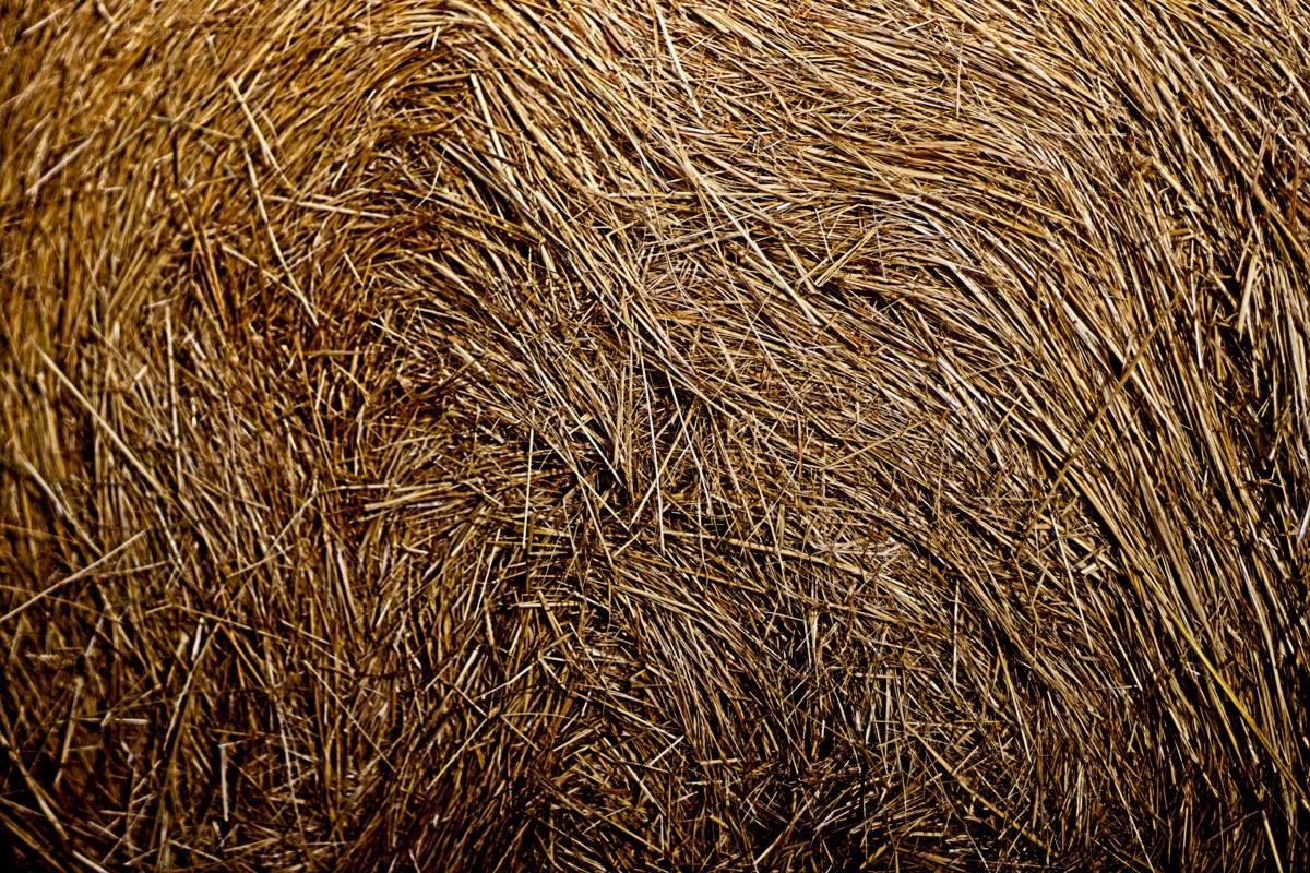
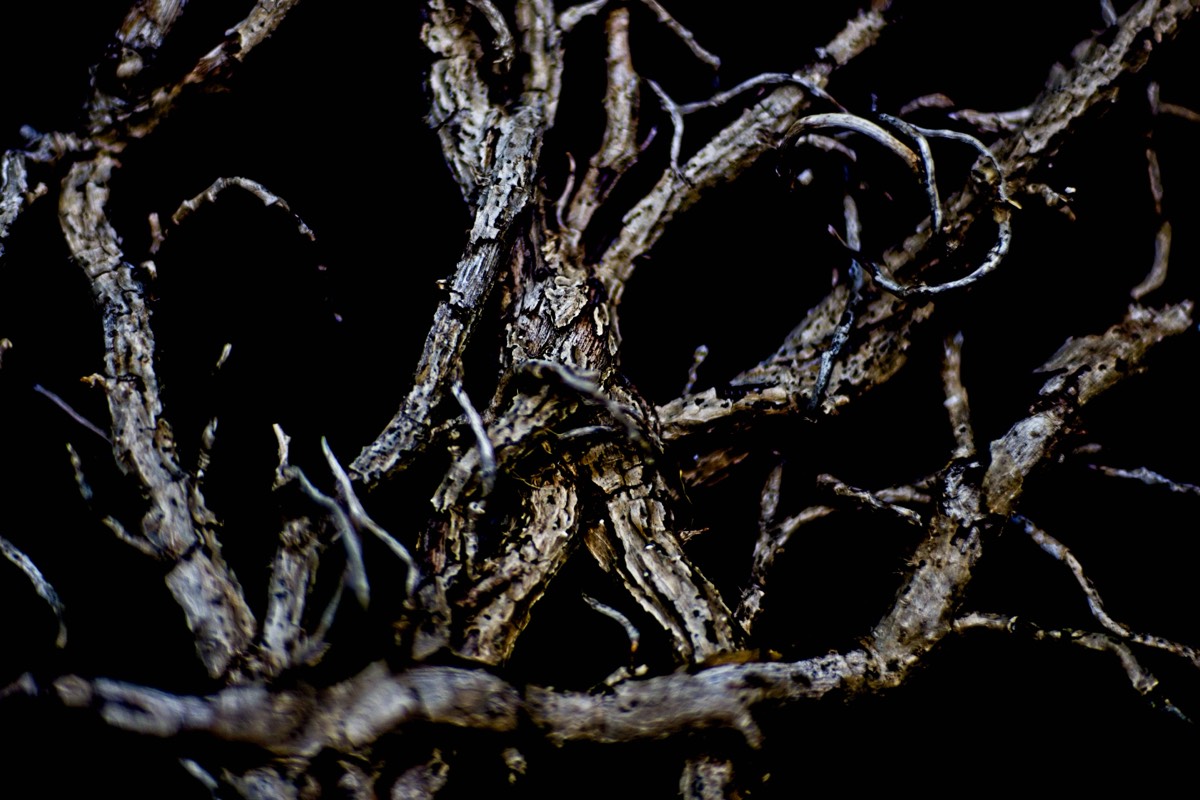
Textures
When I was a teacher to get the students to see textures, patterns and tonal differences, are used to stick to the task of taking a picture with no more than three textures and three tonal changes. This is an extremely difficult task to achieve as we are surrounded by multiple textures that we just do not see.
There are many different types of patterns in photography compositions, like shapes, colours, textures, etc.
Using other photography compositional elements that we already mentioned like symmetry and repetition, we can create very interesting images.
A useful photography composition tip is to combine the negative space with the rule of space to create more interest.
Think about patterns, lines, repeats and shadows.
If we look closely patterns could be found all around us; on a grand scale a row of trees, a field of flowers, in architectural designs etc. and if you look for patterns on a macro level you will discover a whole new world comprising of patterns within patterns within patterns……….a seemingly never ending series of patterns. The pattern of the florets of a flower, the bracts of a pinecone and the scales of a pineapple are all great examples.
Repetition is an original photography composition guideline to make your images stand out.
Repetition
"Art is the imposing of a pattern on experience, and our aesthetic enjoyment is recognition of the pattern." - Alfred North Whitehead
We all know the importance of repetition But repetition is also very valuable in photography. in poetry.
Through repetition, we can use colours, shapes, lines, textures, and other elements in the composition to create an attractive visual flow for the viewer.
But also look for changes in the repetitions. Breaking the flow of the pattern disrupts its rhythm and can add drama to a photograph. The disruption could be natural or can be manipulated by the photographer by introducing an element in a contrasting colour, of a different shape or texture etc. Even removing one of the elements that make up the pattern could work well to break it.
Look for reflections as these are most obvious example of repetitions. Reflections in lakes, ponds, puddles, and other artificial materials. Looking for patterns is another good way to compose balanced images.
Isolating the patterns by excluding everything else from the frame is the key to emphasising patterns. This creates an illusion in the viewers’ minds that the repetition is infinite and extends well beyond the boundaries of the frame. Isolated patterns give a feel of infinite continuity which engages the viewer’s eyes. This technique is commonly used when photographing faces in the crowd.
Geometric Shapes
Another good photography composition example are geometric shapes. Look for triangles, circles, squares, rectangles, and even more complex forms like rhombus or diamonds. The easiest way to find shapes are in architecture, but we can find so many of these compositional elements in nature, too.
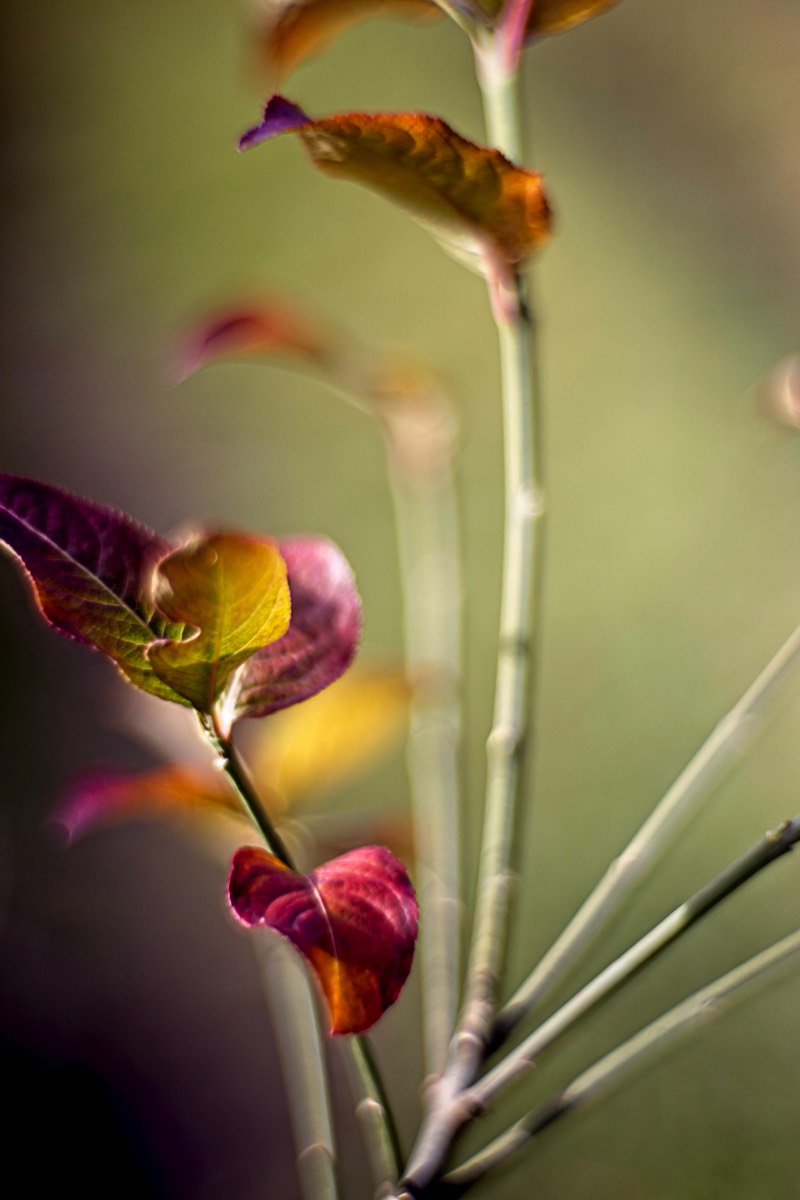
Colour
A typical photography composition error is to forget about colour.
We tend to think about rules, proportions, shapes, and many other elements when talking about photographic composition. However, Colour theory composition is an extraordinary element to creating unique images.
To compose images using colours, try to adjust them following one of the principal colour schemes like analogous, complementary, triads, etc. You can also create more depth by separating warm and cool colours. Don’t forget about visual weight; too many vibrant and saturated colours can be very distracting.
We can play with colours that are both complementary and contrasting.
The image here shows a complementary colour scheme.
Complementary colours are pairs of colours that contrast with each other more than any other colour, and when placed side-by-side make each other look brighter This theory played an important part in the development of impressionism and post-Impressionism as well as fauvism and much modern painting thereafter. The impressionists were the first to note that shadows are not neutral but are the complementary colour of the light that throws them. So yellow sunlight throws a violet shadow.
This can be seen very well in Claude Monet’s Woman Seated on a Bench in the crease of her arm and the pool of shadow at her feet.
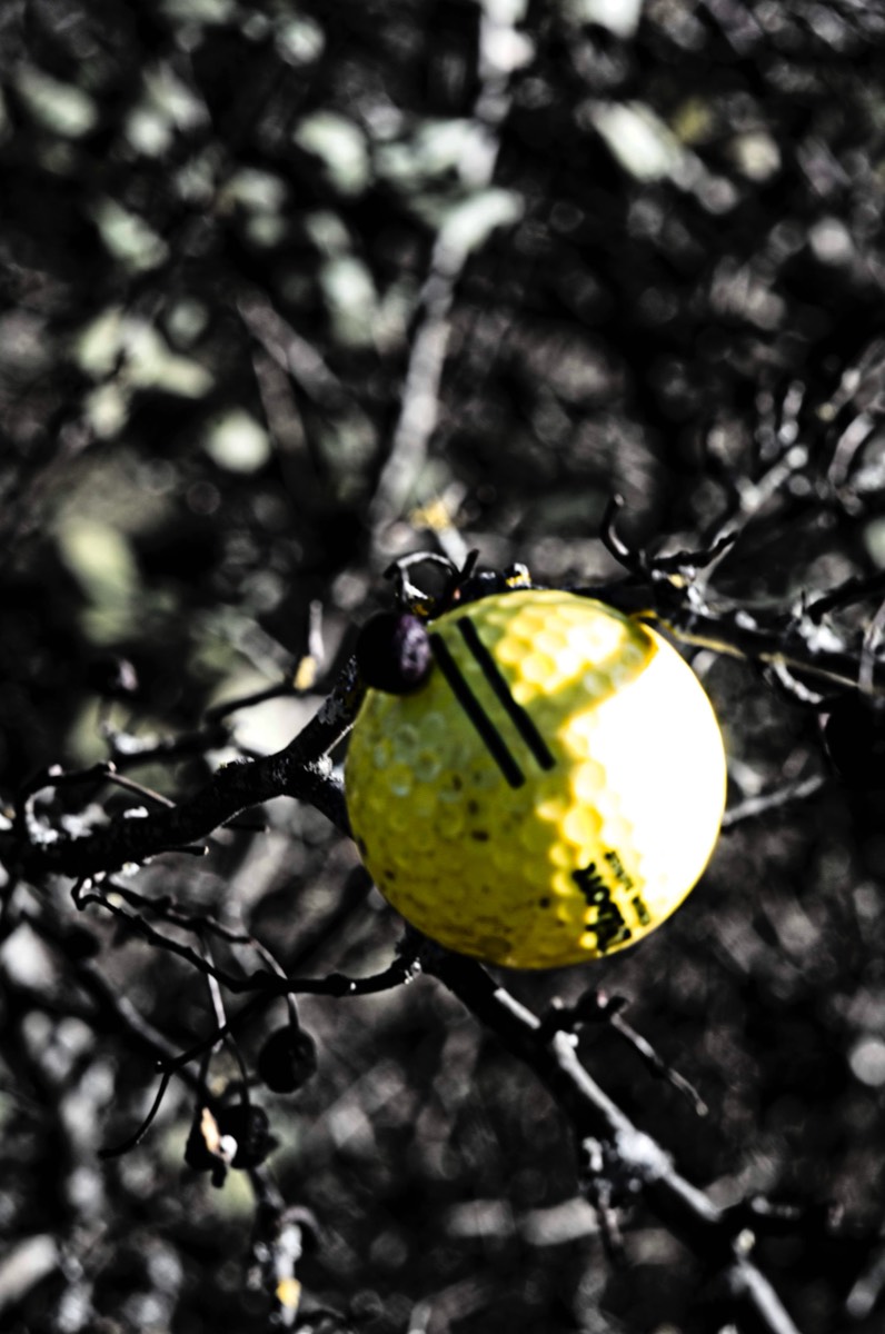
The image here is quite a contrast. It was a real shot of a yellow golf ball that has wedged itself up a tree alongside the golf range. It is my type of golf shot, but I bet they could not achieve it a second time!
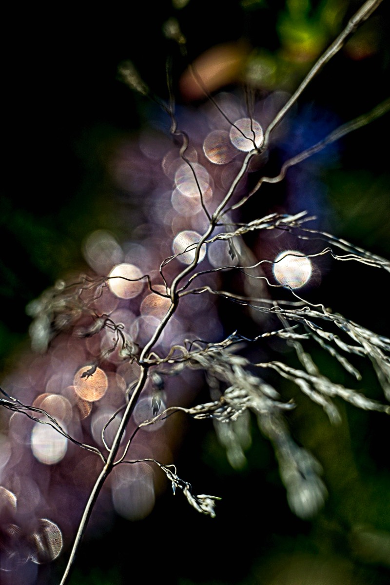
Contrast sensitivity refers to the ability to detect differences between light and dark areas; therefore, if you have low vision, increasing the contrast between an object and its background will generally make the object more visible. White or bright yellow objects or print against a black background usually provide the strongest colour contrast. Whilst the background here is not black it is very dark. Some of the contrast is lost by the bokeh patters however.
This image is in total contrast. But I show the two images to state that we are not looking for perfect contrast just creative contrast.
I am using the term colour here although this is only a human construct to describe how we perceive light at wavelengths within a visual range. There is no direct connection to what we see and our brains, it is a little like FlyBy wire.
When light hits an object, the object reflects some of that light and absorbs the rest of it. Some objects reflect more of a certain wavelength of light than others. That’s why you perceive a certain colour. For example, a lemon reflects mainly yellow light. A strawberry reflects mainly red light. Objects that absorb all wavelengths of light appear black. Objects that reflect all wavelengths of light appear white.
When light hits a transparent object, like water or glass it travels from one medium to another, the light is not reflected like it would be on a solid object. Instead, it bends. That’s because light travels at different speeds in different mediums. This is called refraction.
When light travels through a glass prism at an angle, the different wavelengths of light are slowed down by different degrees so that each colour has a different angle of refraction. As a result, you can see all of the colours contained in white light. But the reflection and refraction of light on an object is just one part of the story. Let’s look at what happens in our eyes and brains when we see colour.
There is a layer at the back of our eyes called the retina. The retinas are home to two types of photoreceptor cells: rods and cones. These specialised cells convert light into signals that are sent to the brain that reconstructs an image. This allows you to see. You have 20 times more rods than cones. Rods allow you to see in low light. Cones are 100% responsible for colour vision. It is hard ito see colour in the dark because only the rods work in low light.
But this distracts us from what I really want to say here, as it is our brains that reconstruct the image, we do not observe all the shades and tones that are picked up by a retina. A camera can pick up everything. This is why we often notice shadows and colours that we did not see when we took the photograph. Portrait photographers use reflectors to remove some of the shadows. But we also need to train ourselves to see all of the tones, not just the reflections of light of the object, but the effect of these reflections on the objects that surround them. This all takes quite a bit of training.
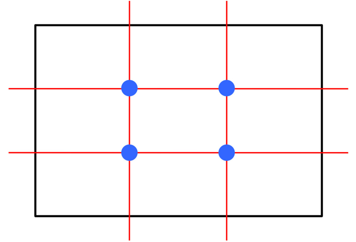
Two Thirds Rule
Most of the photographic guidelines of composition are taken from traditional art, specifically painting. The rule of thirds is one of the composition basics. According to this photo composition rule, if we divide the frame vertically and horizontally in 3 equal sections, we should place the important elements of the image on the lines or at the intersections of the lines. This is one rule I often use myself.
The rule of thirds is a very simple and effective way to frame your composition, and today most digital cameras include compositional grids divided into thirds for composing images. Don't forget there aren't any strict rules to follow. The term "rule" in "rule of thirds" is really the wrong word to use. These are guidelines, not rules. Just go as you feel is the best for you and your subject. No guideline is inferior to another. Rules are meant to be broken anyway.
The rule of two thirds is often quoted as it is the easiest of the mathematical compositional rules. Dividing a scene into 9 cells on a 3x3 grid is easy and quick, and many camera viewfinders/LCD's already present us with such a grid that we can work with.
The Golden Rule
The golden triangle is another of the most popular photography rules of composition. It’s also been one of the main basics of composition in photography and visual arts for centuries.
However the Golden Ratio is a little harder to use. Its advantage is that when you use it to align your primary subjects (such as a facial portrait), it can lead to the most pleasing compositions.
Note the point of convergence of the red and green lines. That particular point is the key point when using the Golden Ratio in photography. The simple rule here is to start from one side of the image, and visualise a square starting from that edge. Bisect that square along a diagonal. Bisect the entire image from the opposing corners, and place the key element of your key subject at the intersection of those bisecting lines. In the case of a portrait (where this rule is commonly used), you would want to place the eyes right around the point of intersection. You can also use this rule to photograph still subjects. It should be noted that the Golden Ratio is infinitely divisible (as you can see in the spiral image above), so you could identify multiple points of intersection for sub areas of a photograph, and place key still subjects at those points. You also have the option of following the spiral, and placing key subjects at the intersection of any two lines and part of the spiral curve.
Ignoring Rules
I do worry about how fixated folk get about all these rules. It is a bit like their fixation on perfect pixels. Or perfect focus. The golden ratio certainly exists mathematically, and it does appear on occasion in nature such as the spirals on a pinecone are one example, I believe, though the spirals on a nautilus are not. However, it is equally well known that if you take enough different measurements then you will find any number or ratios that you want to find. Simply finding the golden ratio somewhere is not anything exciting.
Added to this is the issues of sensor size, and the size of the "standard" photograph, as these aren't in the correct ratio for the golden ratio to be correctly applied! For a photograph to be taken seriously as "having the golden ratio" property, then I'm afraid that it would need to be sized in the ratio of 1:1.6180... The standard photograph should thus be 4 inches by a shade less than 6.5 inches.The fact that standard photographs are 6x4 says that we tend to prefer things that are a bit rectangular, but not too much, and so I would go along with a theory that placing the object of interest appropriate to the picture size makes for a more pleasing picture. But the fact that we're happy with 6x4 pictures and there isn't a huge clamour for 6.4721x4 pictures shows that we're actually not that fussy.
The bottom line is, if you have an exact third line in your LCD grid, you should go slightly to the inside of it, and it'll be a slightly more pleasing location than the exact third point would be.
More About Lines
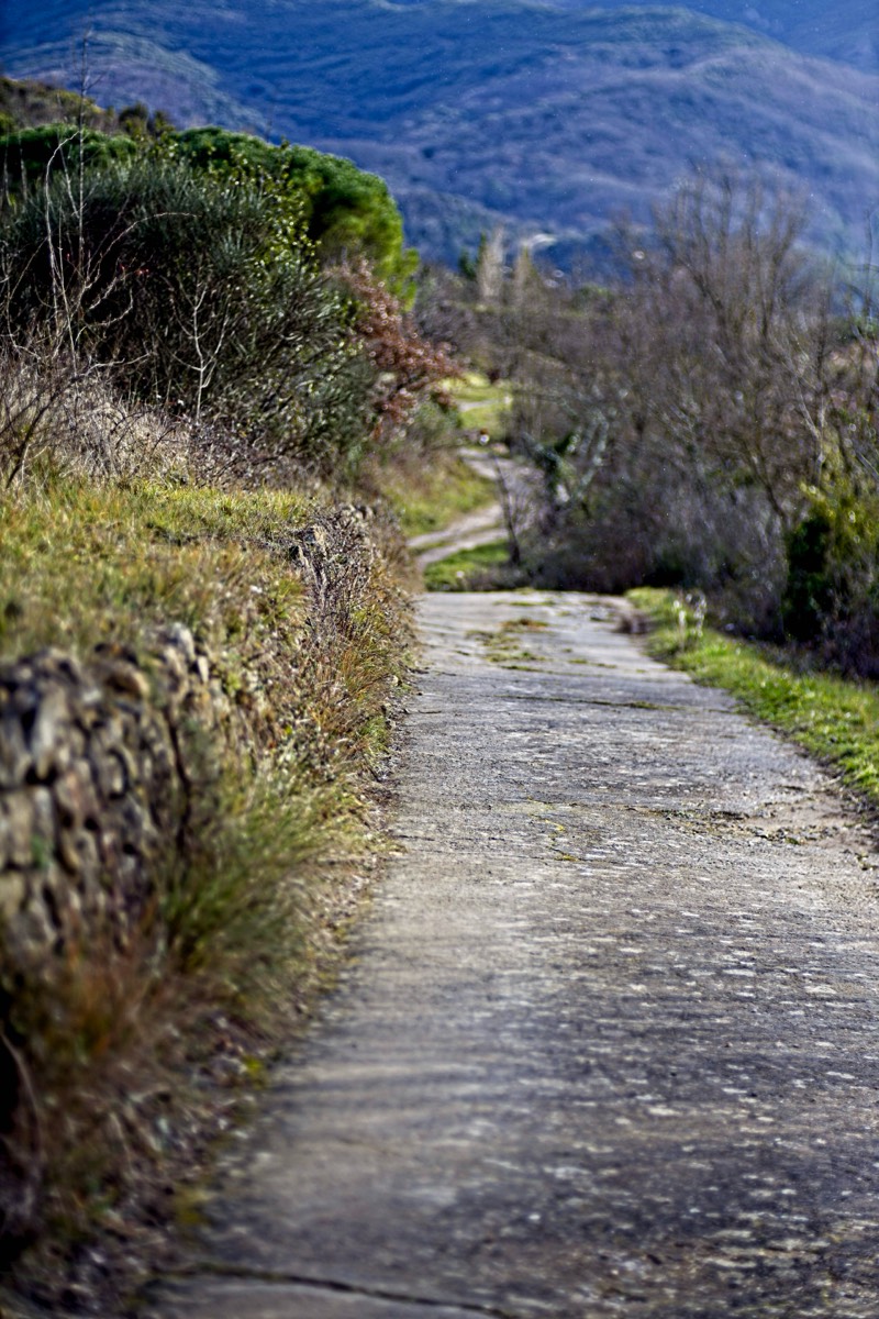
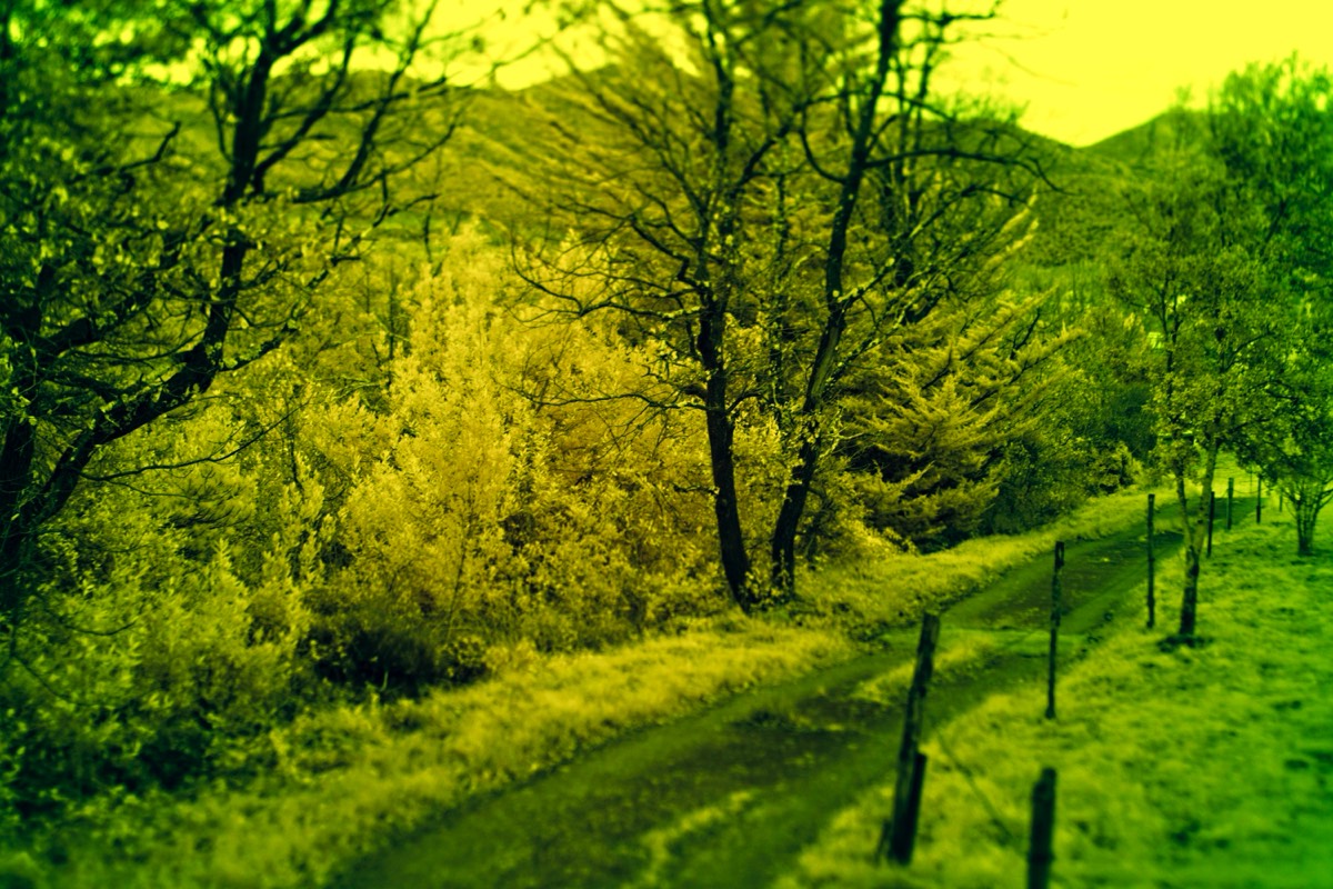
But alongside any debate about these “rules”, we do need to think about the lines in an image and where the lines take the readers eye. Using compositional leading lines is one of the most powerful guidelines of composition to lead the viewer’s eye towards the important or even missing elements in your frame to create an ongoing storyline or suspense. Leading lines do not have to be straight, indeed curved, winding or spiralling lines are often more effective in terms of composition.
Lines and curves are strong compositional lines that can add depth and are easy to implement, making them one of the most common photography composition tips for beginners. There are many different types, but the “S” shape is one of the most powerful compositional curves in photography.
Note the way the track leads the eye into the distance and the lining up of the very distant tracks into the hills.
Bias
As stated earlier 1000 images speaking 1000 words in a single image is one of the most common photography composition mistakes. This is often the result of placing the main subject against a cluttered background simply focusing on the picture of the main subject and not looking at the whole composition. This always distracts the viewer and will makes image less visually appealing unless, of course, you are the person who was taking the photograph and therefore you know what you should be focusing your eyes on. Bias is a natural feature of human nature. In short we see what we want to see, this does not mean that the viewer knows what it is that we are trying to tell.
Personally I try to think about the background, including compositional lines and Bokeh before I even consider the main focus point or object of the photograph. I change aperture and focal distance just to see what the background is likely to look like before I even attempt to position myself for the photograph. I say positioning myself because often people use the focus ring and forget that also able to move themselves and the camera and that this is often more effective than simply changing the focus using the lens focus ring. This is where the use of automatic features such as auto aperture and auto focus in modern digital cameras prevents good composition. Without thinking about the correct aperture it is not possible to decide which parts of the composition need to be clear as they are are important to tell the story and which parts need to be blurred or out of focus so that they do not distract. Again like using words as our language, we need to decide which are important and which are actually superfluous.
Abstraction
One way to force yourself to think in a different way, is to experiment with abstract photography. Abstract photography is challenging to define. It is taking a subject and forcing the viewer to look at it in a different way. This may cause the subject to lose its original meaning or purpose. The subject could lose all literal meaning and be reduced to only shape, light, texture or colour.
It takes creative imagination and concept to be able to capture subjects in an abstract way. You are only limited by your vision and ideas. Changing your usual perspective of the subject helps to create abstract images.Shooting from up-down could allow you to focus on its shape and form. This changes the subjects’ meaning and purpose.
This image is simply a blade of grass and reflected sunlight off a river in the background.
Multiple exposures and ICM (Intentional Camera Movement), rubber lens mounts and free lensing all mentioned on this site can also help.
What you will discover from practising this field is the philosophy of subtraction. More often than not, what you leave out of the image is as important as what you put in. Mastering the freedom of composition is the key to any abstraction and the key to understanding composition.
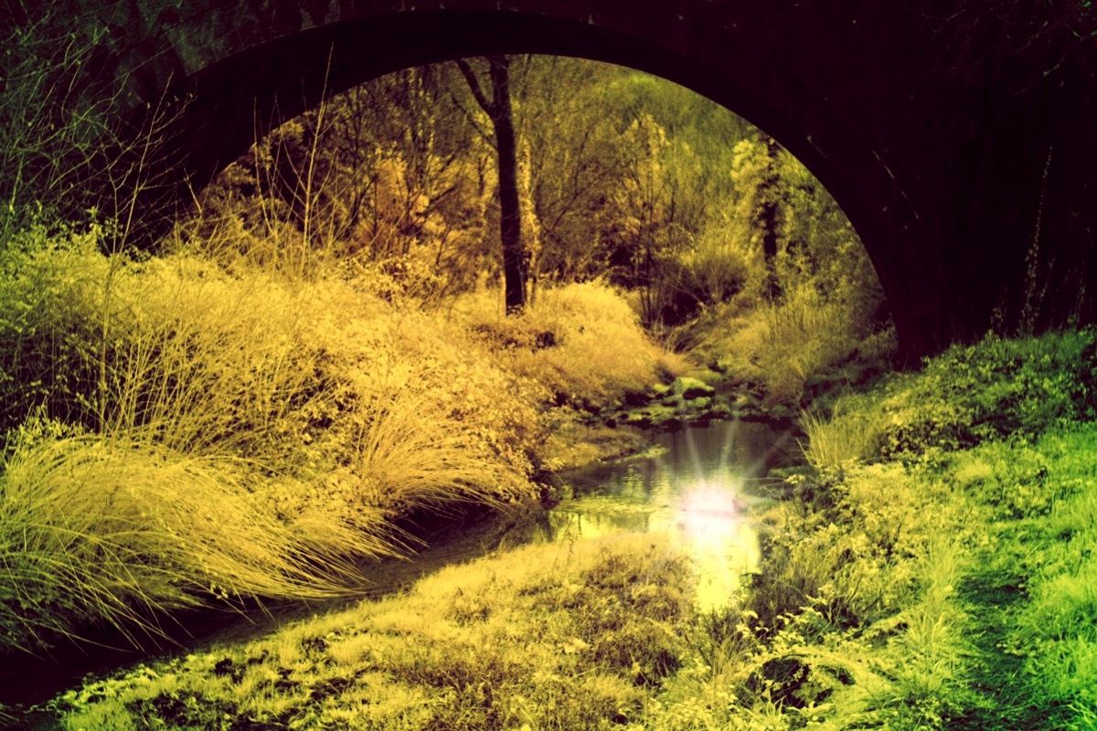
Frames within Frames
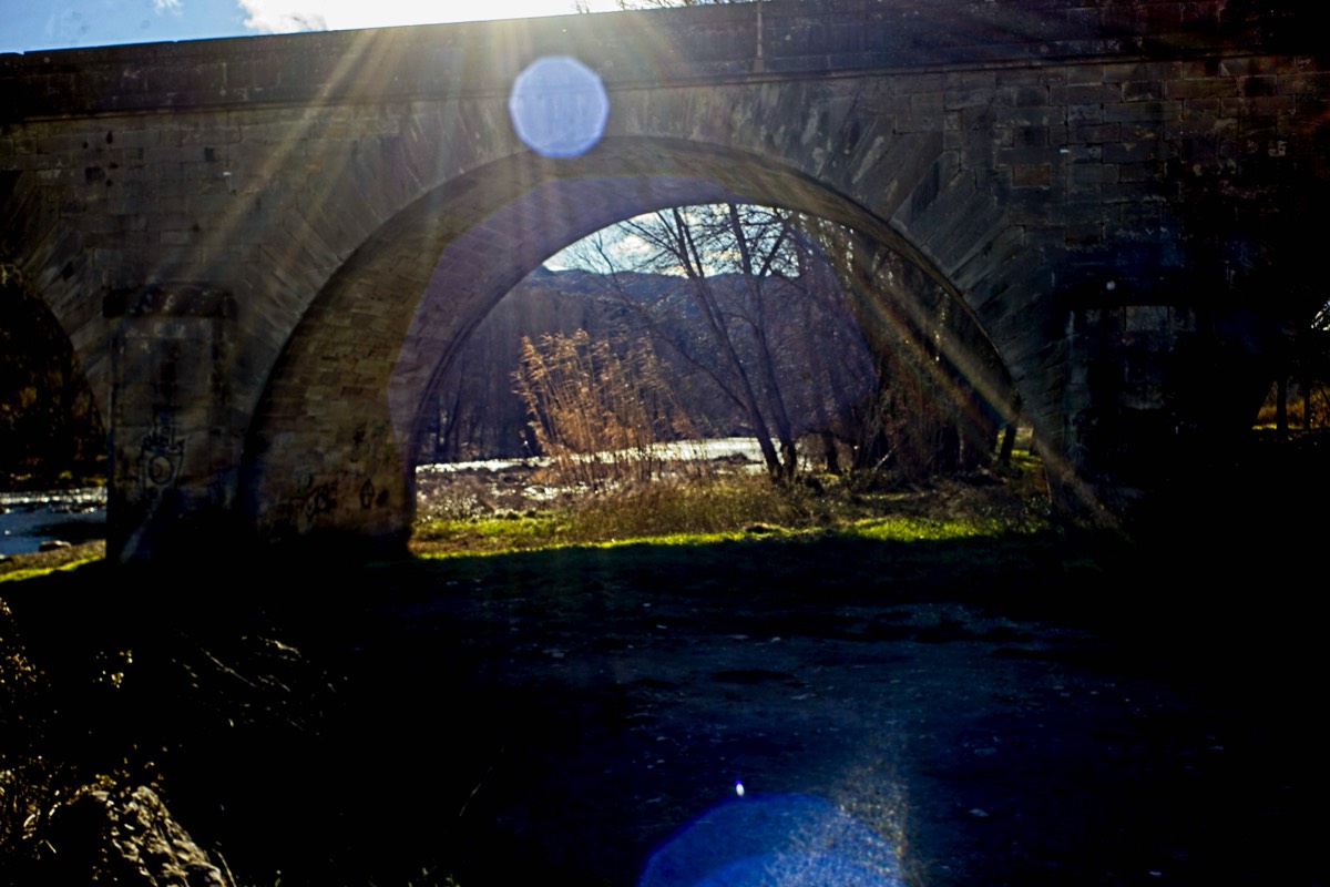
Another striking technique in photography is to create a frame within a frame in your composition. Doorways, bridges, windows, holes and even trees and plants to create the frame. But to make sure that composition still takes your eye to the main focal point.
This image also uses lens flare to contrast the lines with the curves of the bridge.
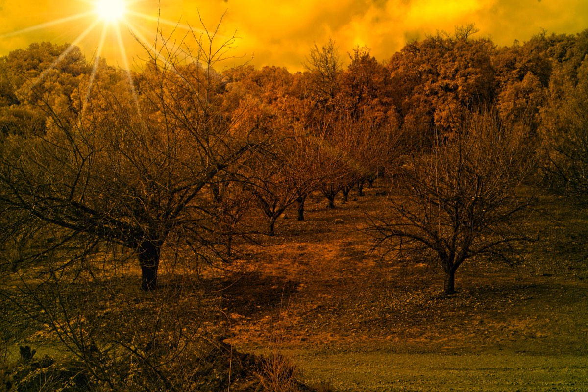
Scale
Scale is a compositional technique related to the proportion of the elements and how they relate to each other in terms of size, distance, etc.
A good composition tip is to place an element that we can recognise to show a sense of scale, like placing a person or animal against a vast landscape.
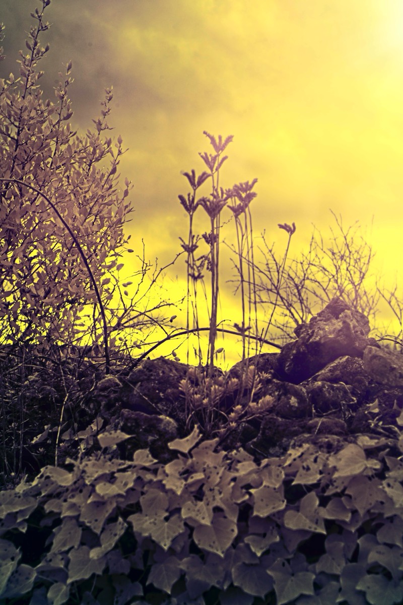
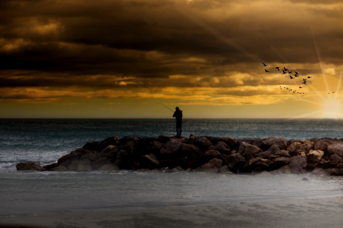
In this image the leaves add scale. In the image above it is the trees. In the image below the fisherman and the birds and in the other image the lighthouses.
Depth
There are many compositional elements that help to create depth. Atmosphere is one of the key compositional elements in landscape photography to add more depth and interest to your images.
Capturing or enhancing the atmosphere, you’ll get a more ethereal feeling in your photography framing and you’ll make the viewer feel as if they were part of the scene.
Another compositional technique to include in your camera compositions is to compose using layers. Layers add dimension to the image, creating an illusion of depth and volume.